[JS/라이브러리] chart.js - 차트 라이브러리 사용법
chart.js란?
canvas를 이용하여 다양한 종류의 차트를 생성할 수 있는 데이터 시각화 라이브러리다.
이 라이브러리를 사용하면 쉽고 간단하게 데이터 기반의 반응형 차트를 생성할 수 있다.
Getting Started | Chart.js
Getting Started Let's get started with Chart.js! Alternatively, see the example below or check samples. Create a Chart In this example, we create a bar chart for a single dataset and render it on an HTML page. Add this code snippet to your page: You should
www.chartjs.org
사용법
1. 다운로드
// cdn
<script src="https://cdn.jsdelivr.net/npm/chart.js"></script>

// npm
npm install chart.js
2. 기본 구성
<body>
    <!-- 차트 표시할 엘리먼트 -->
    <div class="container text-center">
        <div class="row">
            <div class="col-md-12">
                <canvas id="chart-container"></canvas>
            </div>
        </div>
    </div>
    <script>
        const chartEl = document.getElementById('chart-container').getContext('2d');
        const barChart = new Chart(chartEl, {
            type: 'line',
            data: {
                labels: ['1월', '2월', '3월', '4월'],
                datasets: [{
                    label: '월별 매출액',
                    borderWidth: 3,
                    data: [
                        30000000,
                        80000000,
                        120000000,
                        300000000
                    ]
                }]
            },
        });
    </script>
</body>
3. 설정 옵션
- type: 차트의 유형
- datasets: 차트에 표시되는 데이터 정의
- label: 데이터셋의 레이블
- data: 차트에 표시할 실제 데이터값
- labels: 차트의 각 데이터 포인트에 대한 레이블
이외에도 범례 설정을 위한 legend 등 다양한 옵션들이 있다.
결과 화면
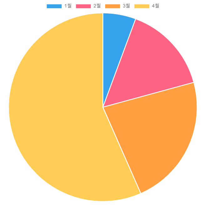
차트 종류로는 아래같은 'bar', 'doughnut', 'line', 'radar', 'pie', 'polarArea', 'bubble' 등이 있다.
type에 단어를 넣어주면 원하는 차트 유형으로 변경할 수 있다.
① type: 'bar' - 막대 차트

② type: 'doughnut' - 도넛 차트

③ type: 'line' - 선형 차트

④ type: 'radar' - 레이더 차트

⑤ type: 'pie' - 파이 차트
⑥ type: ' polarArea ' - 원형 영역 차트

⑦ type: ' bubble ' - 버블 차트

이외 추가적으로 기존 차트에 데이터 레이블을 추가하려면 아래의 datalabels 라는 플러그인을 추가로 설치해줘야 한다.

Getting Started | chartjs-plugin-datalabels
Getting Started Installation npm (opens new window) (opens new window) CDN (opens new window) (opens new window) By default, https://cdn.jsdelivr.net/npm/chartjs-plugin-datalabels returns the latest (minified) version, however it's highly recommended (open
chartjs-plugin-datalabels.netlify.app